I designed the Swedish Peptides ecommerce experience to help customers make confident purchasing decisions through clearer information architecture, stronger trust signals, and a modern visual system.
Role
Platform
Client
Year

Buying peptides online isn't like buying a pair of shoes or ordering electronics. Customers are naturally cautious. They question product quality, supplier legitimacy, shipping reliability, and whether they're purchasing from a business they can trust. Yet much of the industry still relies on outdated websites that overwhelm visitors with technical information while doing little to inspire confidence.
Swedish Peptides was created to challenge that pattern.
The goal wasn't simply to launch another online peptide store. The ambition was to build a premium Scandinavian brand that felt approachable, credible, and professional from the very first interaction. Every part of the experience needed to reinforce that positioning, from the visual language and product discovery to the information architecture and checkout journey.
I was responsible for designing the product experience from the ground up and bringing it to life in WordPress, transforming an early business idea into a fully functional eCommerce platform.


Swedish Peptides is a Swedish eCommerce platform focused on growth hormone injection pens, including HGH, HCG, and Testosterone products.
Unlike many competitors that present themselves as laboratory suppliers, Swedish Peptides wanted to establish itself as a modern consumer-facing brand. Rather than communicating complexity, the website needed to communicate confidence.
This project involved designing the complete digital experience from scratch, including the user experience, interface design, responsive layouts, reusable design system, and implementation. Every decision was guided by one objective: reduce uncertainty and make purchasing feel trustworthy.
I worked as the sole product designer throughout the project, leading product strategy, UX research, interface design, responsive design, component systems, prototyping, and front-end implementation in WordPress.
Rather than designing isolated screens, I defined the overall customer journey, established the visual language, organised the product catalogue, and translated the design into a live production website.

The challenge wasn't a lack of products. It was a lack of confidence.
Through competitor analysis, I found that many peptide websites shared the same shortcomings. Interfaces were visually cluttered, navigation structures were difficult to scan, product information was inconsistent, and trust-building elements were often buried deep within the experience. Many stores adopted a clinical laboratory aesthetic that unintentionally made shopping feel intimidating rather than reassuring.
For a new business entering this market, simply matching competitors would not be enough. The experience needed to differentiate itself by making trust visible at every stage of the customer journey.
I reviewed more than twenty peptide retailers across Sweden, Norway, the UK, and North America to understand how established businesses presented similar products. While branding differed, the customer experience was remarkably consistent. Many websites prioritised technical information over usability, making it difficult for customers to quickly assess products or feel confident in the business. These patterns revealed an opportunity to differentiate Swedish Peptides through simplicity, consistency, and trust.

Instead of asking how the website should look, I first asked how customers make purchasing decisions.
Someone visiting Swedish Peptides typically arrives with one of two mindsets. They either know exactly what they're looking for, or they're evaluating whether the business deserves their trust.
This observation influenced almost every design decision.
The homepage would not function as a promotional landing page. Instead, it would establish credibility before encouraging exploration. Product listings would prioritise clarity over density. Content would support purchasing decisions without overwhelming users with unnecessary technical detail.
Rather than forcing users to search for reassurance, reassurance would become part of the interface itself.
One of the strongest opportunities was positioning. Many competitors leaned heavily into scientific imagery, dark colour palettes, and laboratory-inspired interfaces. While technically accurate, these visual choices often created unnecessary friction for customers.
The design language draws inspiration from Scandinavian principles of simplicity, restraint, and clarity. Large amounts of whitespace, structured typography, subtle colour palettes, and carefully balanced layouts create an experience that feels calm rather than clinical.


First impressions reduce uncertainty
Trust was treated as a product feature rather than a marketing message.
Instead of relying on a single testimonial section or certification badge, credibility is reinforced throughout the customer journey.
The homepage immediately introduces quality standards and product categories. Product cards surface important information without overwhelming users. Educational content answers common questions before uncertainty becomes hesitation. Consistent typography and spacing create predictability, while the overall visual system reduces cognitive load and keeps attention focused on the products.
Each individual design decision may appear subtle in isolation, but together they create an experience that feels deliberate, transparent, and reliable.

Trust reinforced through social proof
Instead of asking users to trust marketing claims, authentic customer testimonials provide independent validation. Real names, profile photos and detailed experiences make the section feel genuine while reducing perceived purchase risk.

Simplifying product comparison
The catalogue was designed to help users move confidently from browsing to decision-making.
Rather than presenting products as long technical lists, the experience uses a modular card system with consistent hierarchy, making products easier to compare at a glance. Categories are clearly organised, allowing both experienced customers and newcomers to find relevant products quickly.
This modular approach also gives the business flexibility to expand its catalogue without introducing inconsistency across the platform.

Reducing hesitation before purchase
Rather than forcing users to contact support, frequently asked questions answer common concerns directly within the browsing experience. This helps remove uncertainty while keeping users focused on completing their journey.

Responsive by Design
Customers discover products across desktop, tablet, and mobile devices, making responsiveness essential rather than optional.
Every layout was designed with adaptation in mind rather than simple scaling. Navigation simplifies naturally on smaller screens, product cards maintain readability, and content hierarchy adjusts to preserve usability regardless of screen size.
The result is a consistent shopping experience that feels equally intuitive across devices.
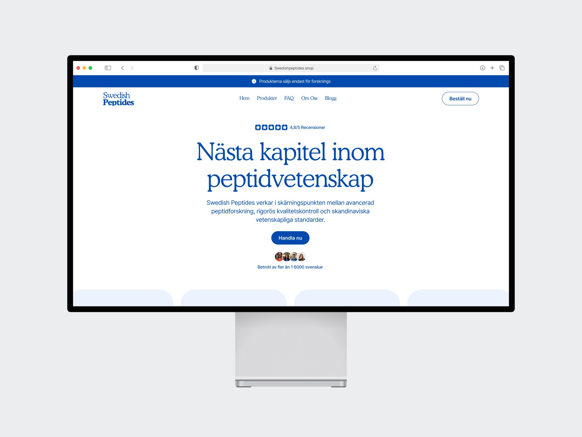
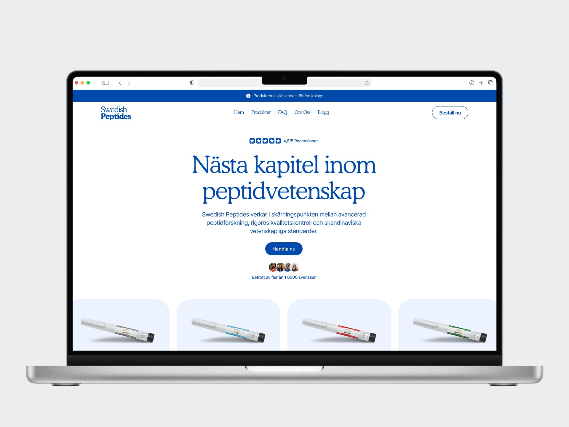
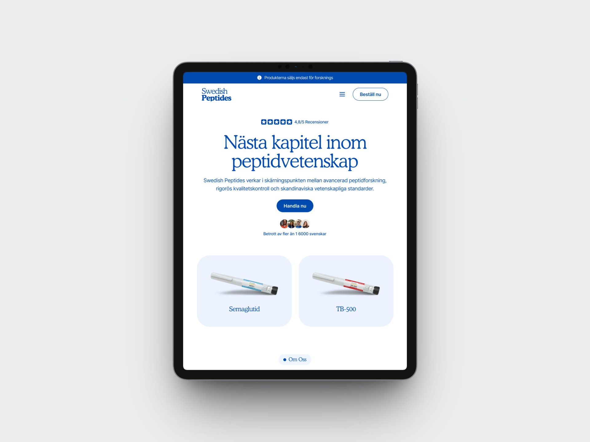
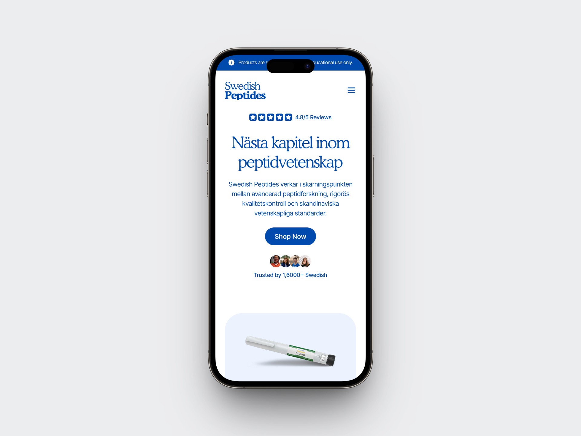
Swedish Peptides launched as a premium digital experience that clearly differentiates itself within a crowded market.
Rather than adopting the conventional laboratory aesthetic common across peptide retailers, the platform positions the brand through clarity, simplicity, and trust. The modular design system provides a foundation for future growth, while the customer journey reduces friction by making important information easier to discover and understand.
More importantly, the project demonstrates how thoughtful product design can become a competitive advantage in industries where credibility plays a critical role in purchasing behaviour.
Looking back, the most valuable lesson from this project is that trust cannot be designed through a single feature. It emerges from the accumulation of hundreds of intentional decisions, from typography and spacing to navigation, hierarchy, and content organisation.
Building Swedish Peptides from the ground up reinforced the importance of designing beyond aesthetics. Every screen, interaction, and component was created with a single objective in mind: helping customers feel confident enough to move forward.
The final product is more than an eCommerce website. It is a digital experience that transforms a complex, high-skepticism market into one that feels approachable, professional, and trustworthy.
Back to the top